PK Marlin: Web redesign
In this project, I transformed an outdated, static website into a vibrant and functional digital platform for a swimming club. The focus was on improving the user journey—from first impressions to final course registration—by combining a friendly visual language with a clear information hierarchy.
Identifying Friction Points
The original website suffered from several critical UX and UI issues that hindered trust and usability:
- Outdated Aesthetics. A dark, static visual that didn’t reflect the joy and energy of children’s sports.
- Poor Scannability. Key information about courses, pricing, and schedules was buried in dense text blocks on a dark background.
- Missing Navigation. The lack of a main menu made it difficult for users to explore the club’s offerings or team background.
- Incomplete Registration. The original form was visually inconsistent and lacked critical data fields (e.g., date of birth), leading to administrative overhead.
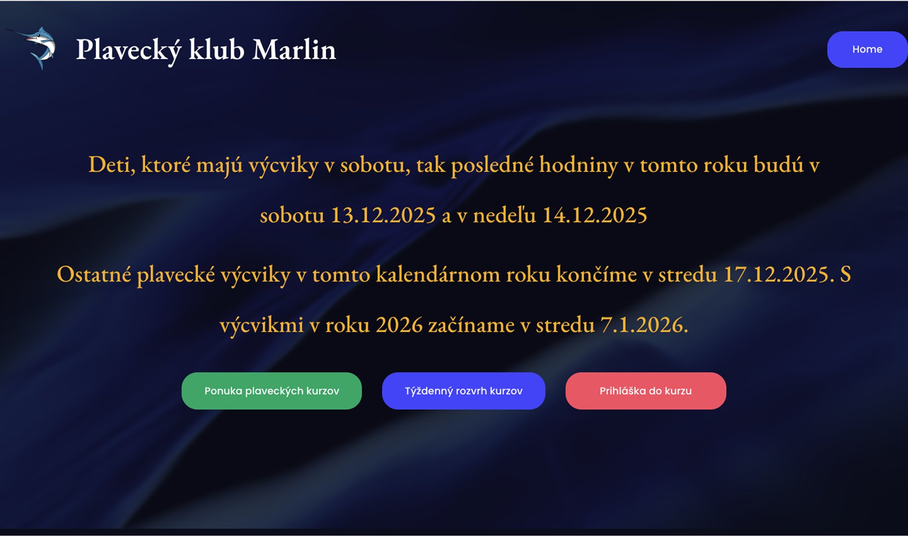
Main screen — original (before)
Research & Visual Inspiration
Benchmarking the Competition
Before diving into the visual design, I conducted a competitive analysis of local swimming clubs to understand industry standards and user expectations. I focused on how competitors presented their courses and handled the enrollment process. My research revealed that many similar websites struggled with high information density and lacked a clear visual hierarchy.
The Goal
The goal was to find a balance between professional sports coaching and a family oriented, welcoming atmosphere.
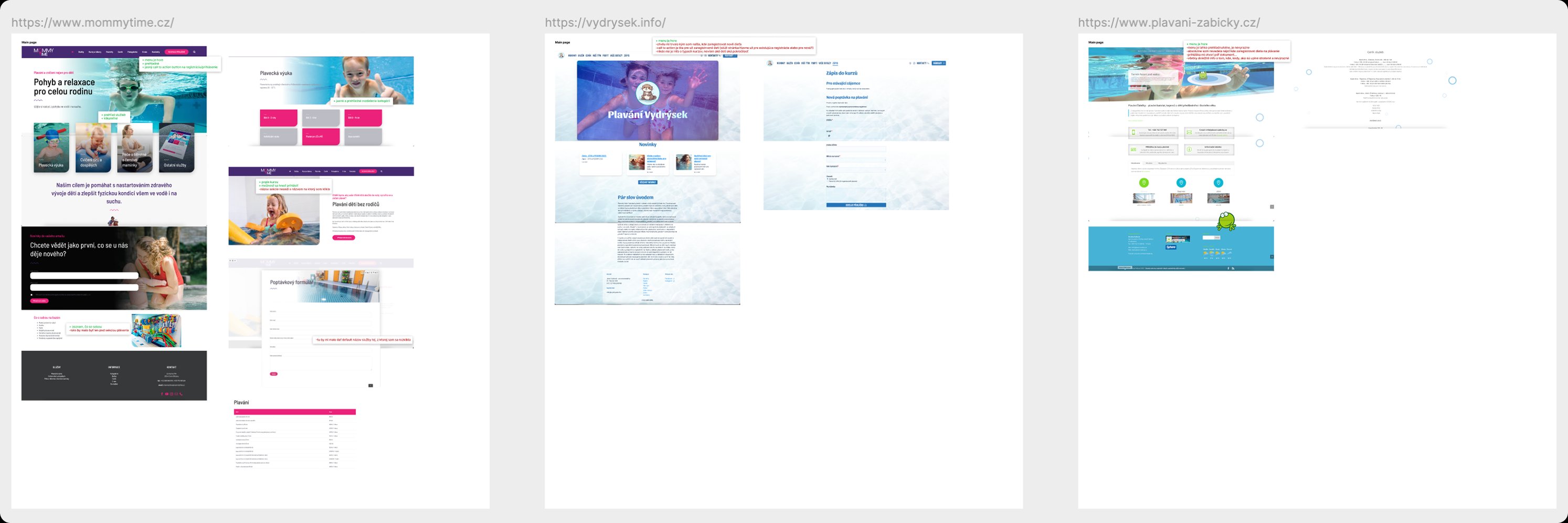
Benchmarking — competitor analysis
Visual Direction & Moodboard
The core philosophy of the redesign was a single mission: “Help lighten parents’ mental load”. I wanted to create an experience that felt as intuitive and refreshing as a dip in the pool.
- Moodboard Curation. I curated a visual board that combined fluid water inspired shapes with high energy photography.
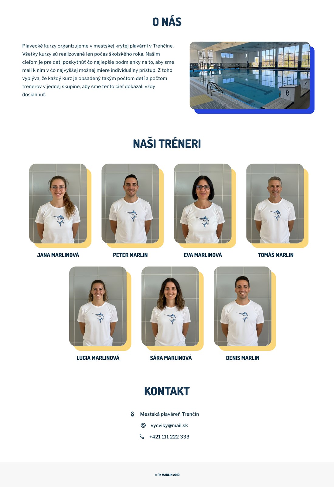
- Symbolism. The “Marlin” mascot was integrated to provide a friendly, recognizable face for the brand, making the club feel more approachable for children.
- Visual Balance. By contrasting a professional Dark Blue (#193A56) with a playful Vibrant Pink (#FC85F9), I created a UI that feels both reliable for parents and fun for kids.
Main colors
Secondary colors
Fonts
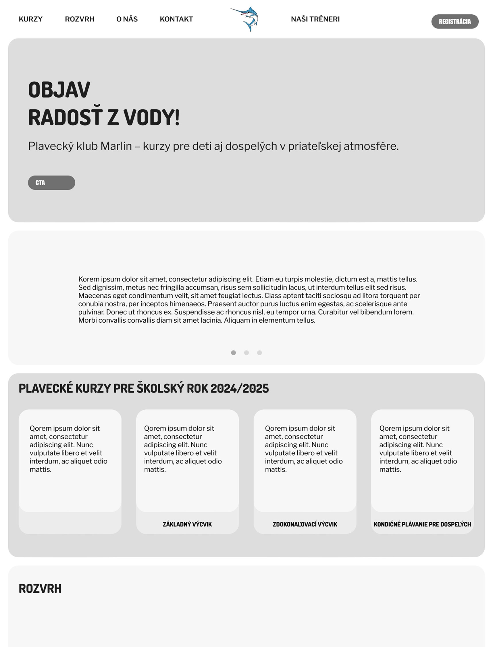
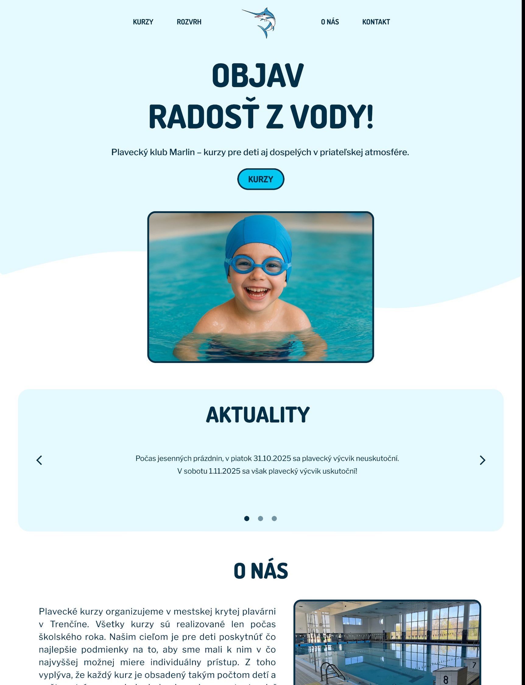
First sketches
The solution
The main screen
The first impression is critical for parents looking for a safe environment for their children.
The problem. The old design felt static and dated. Key sections like About Us and “Coaches” were hidden, which negatively impacted the club’s credibility.
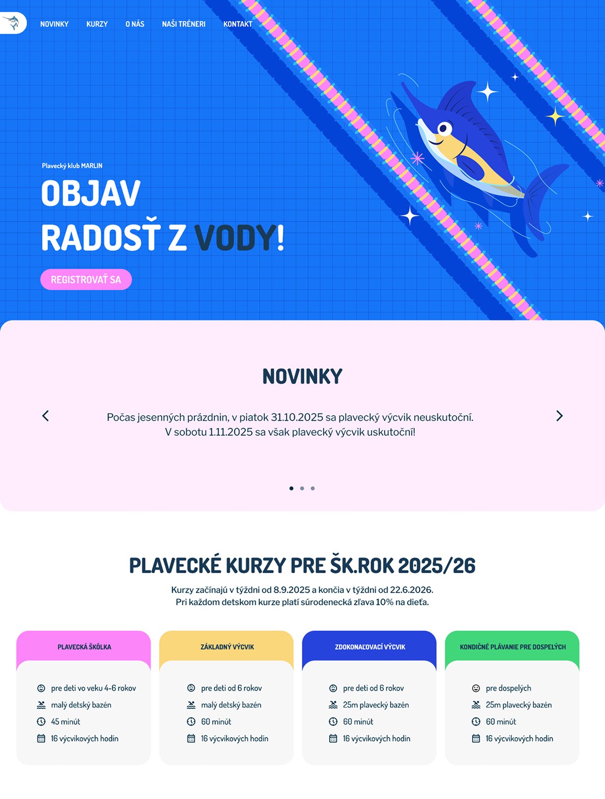
The solution. I introduced a dynamic, friendly visual with a custom mascot Marlin. This immediately communicates the club’s energy to the target audience. I added a persistent main menu and a clear “Register” call to action (CTA) right in the hero section to shorten the user journey.
Before
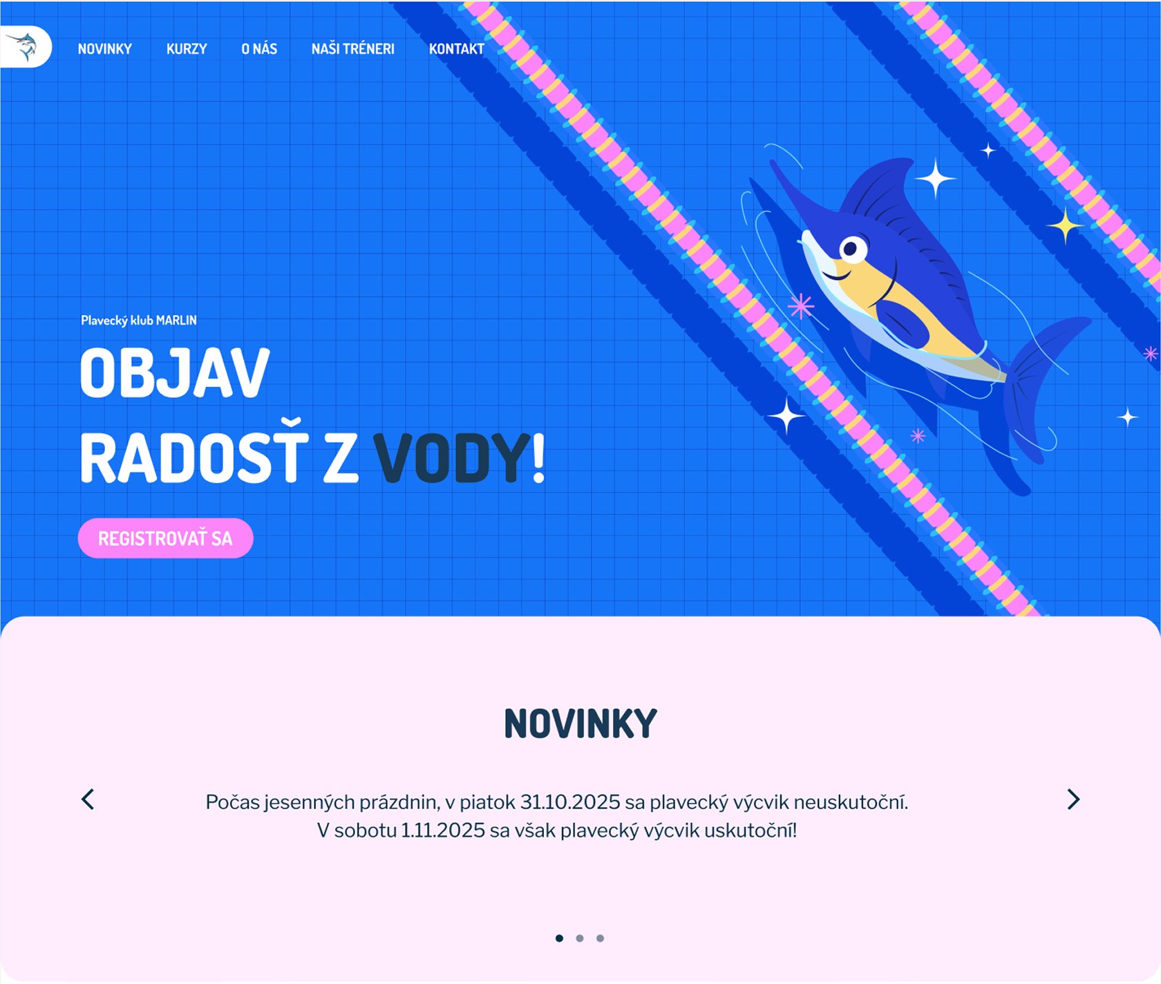
After
The Course Catalog
Parents need to find the right class for their child’s age and skill level without reading walls of text.
The problem. In the old design, courses were presented in heavy text blocks on a dark background. It was impossible to scan for key details like price or age groups at a glance.
The solution. I designed light, icon driven cards that highlight the four most important parameters: Age, Pool Type, Duration, and Number of Lessons. This structured layout allows parents to compare classes instantly and reduces the mental effort required to make a choice.
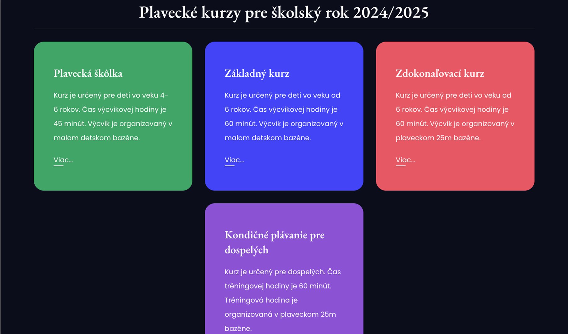
Before
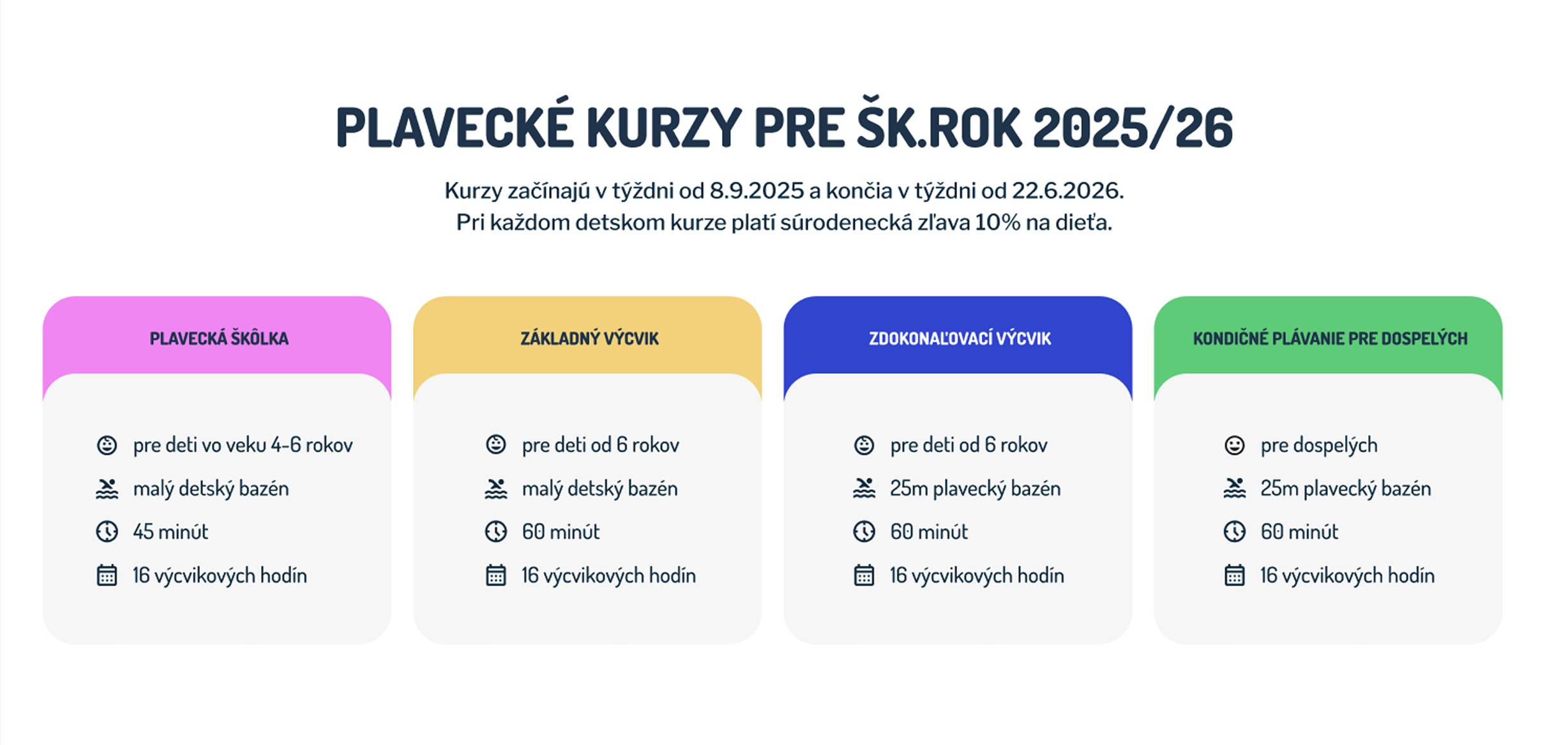
After
The Course Detail
The detail page is where the actual decision happens.
The problem. The detail page lacked visual hierarchy. Critical info about pricing and lesson compensation was lost, and there was no overview of available slots.
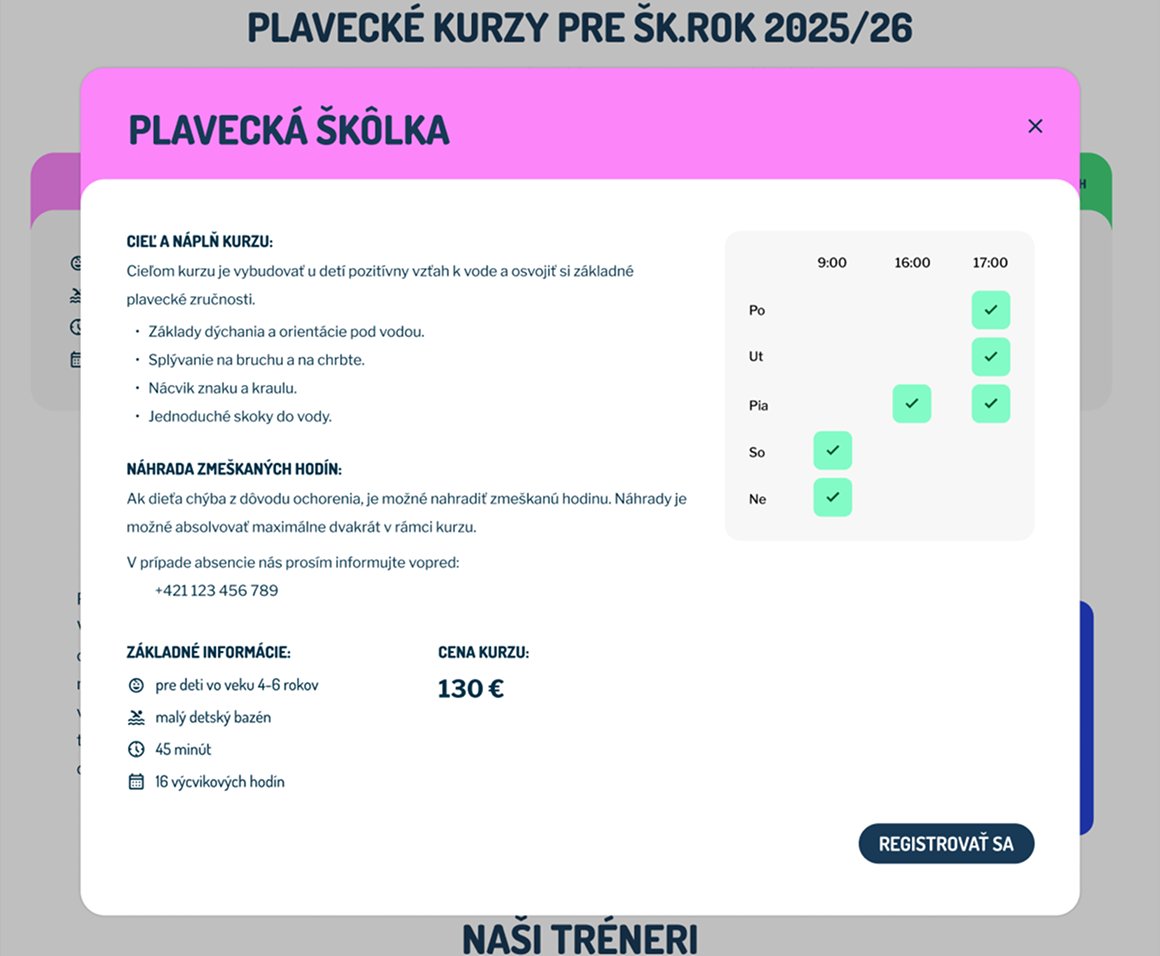
The solution. I broke the information into scannable sections: Goal, Info, and Price. I designed a visual schedule with availability indicators (checkmarks). By clicking a slot, parents can see the specific coach (e.g., Jana Marlinová). This answers the most common questions upfront and saves the club’s administration hours of phone calls.
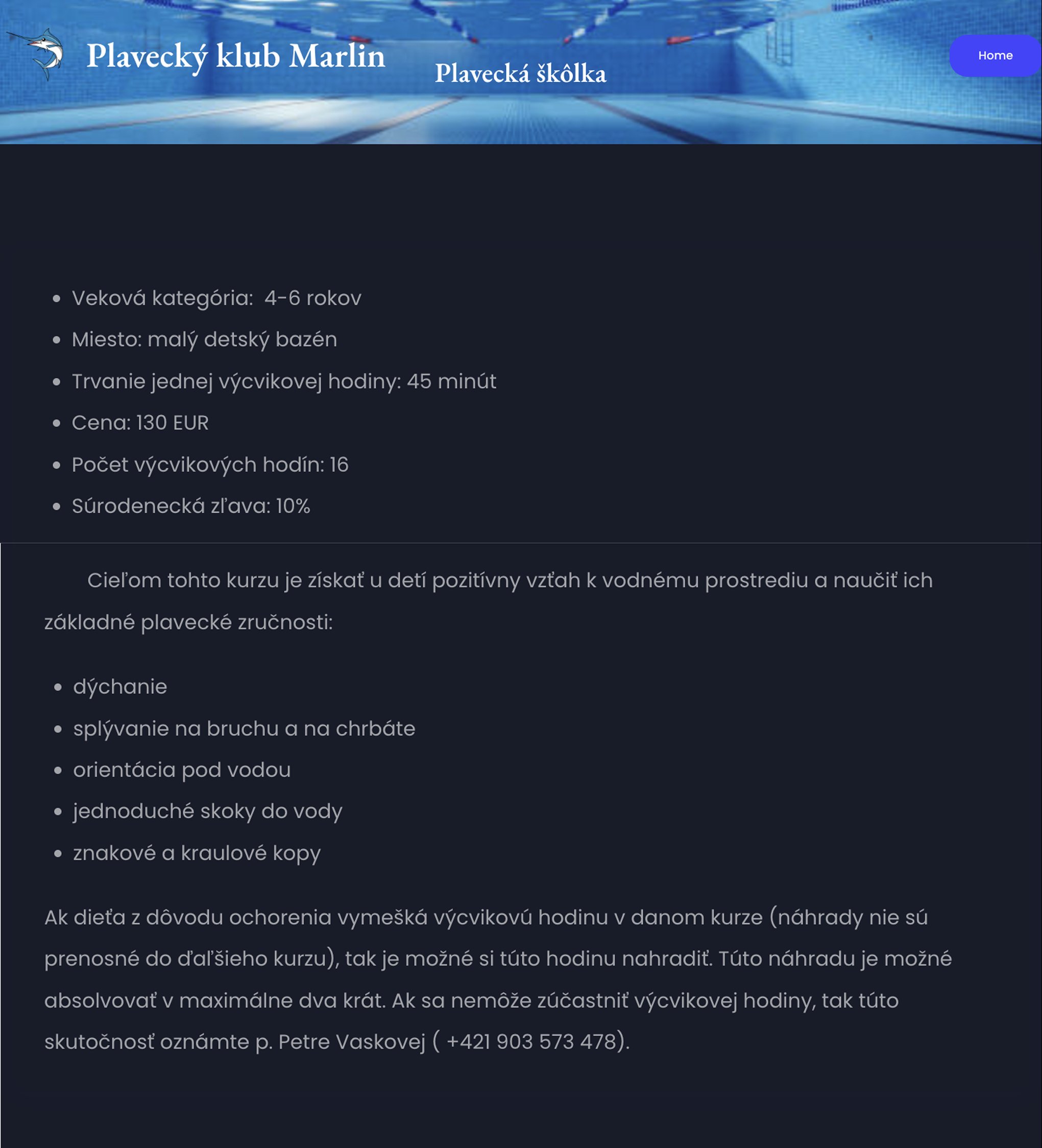
Before
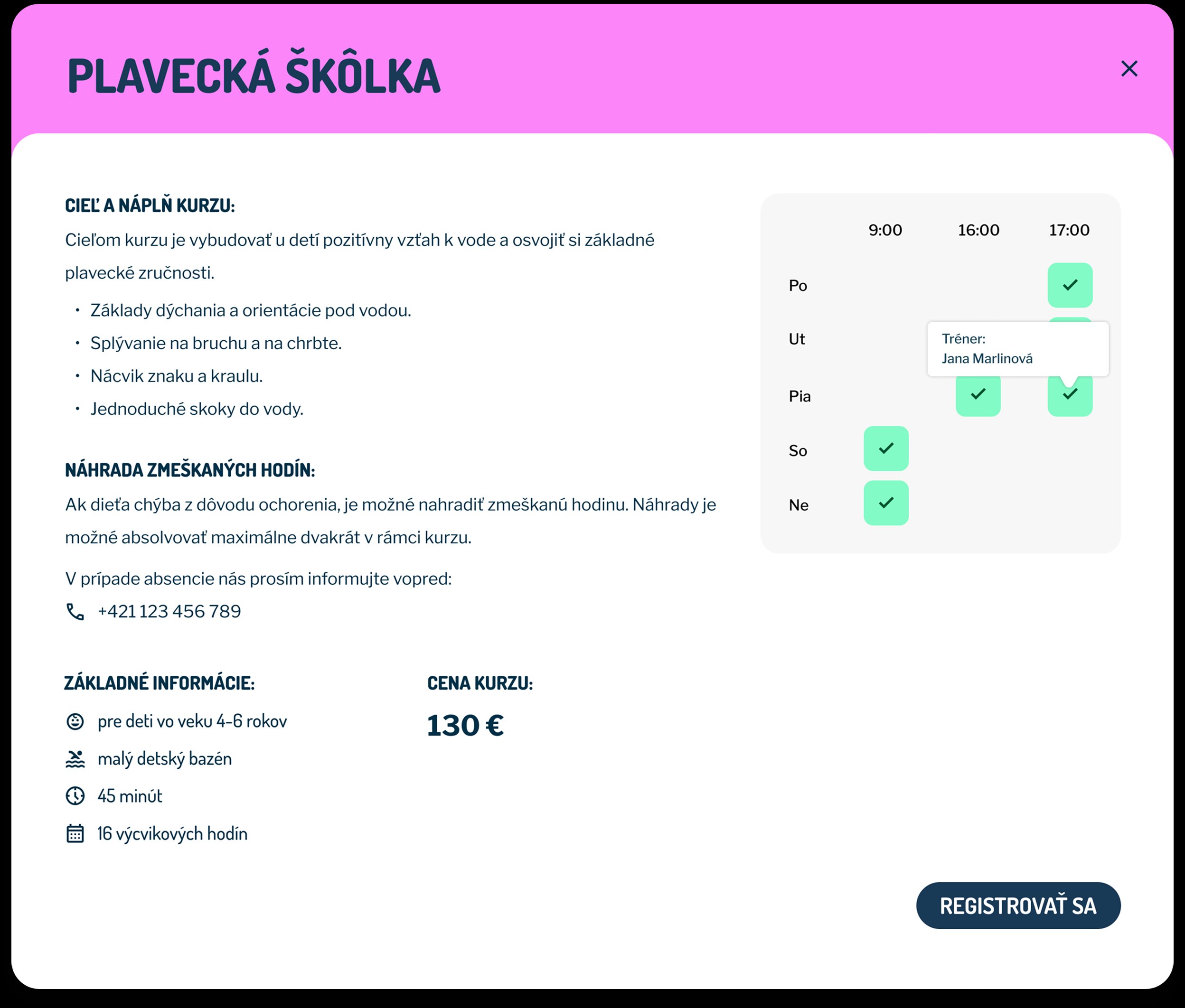
After
The Registration
A bad form is where most users drop off.
The problem. The original registration form was visually inconsistent and, more importantly, incomplete. It was missing critical fields like the child’s date of birth.
The solution. I redesigned the form into three logical clusters: Course, Child, and Legal Guardian. The new form includes the preferred time slot and a “Notes” section for specific needs (e.g., “Amálka is afraid of water”), ensuring the club has all the data they need before the first lesson.
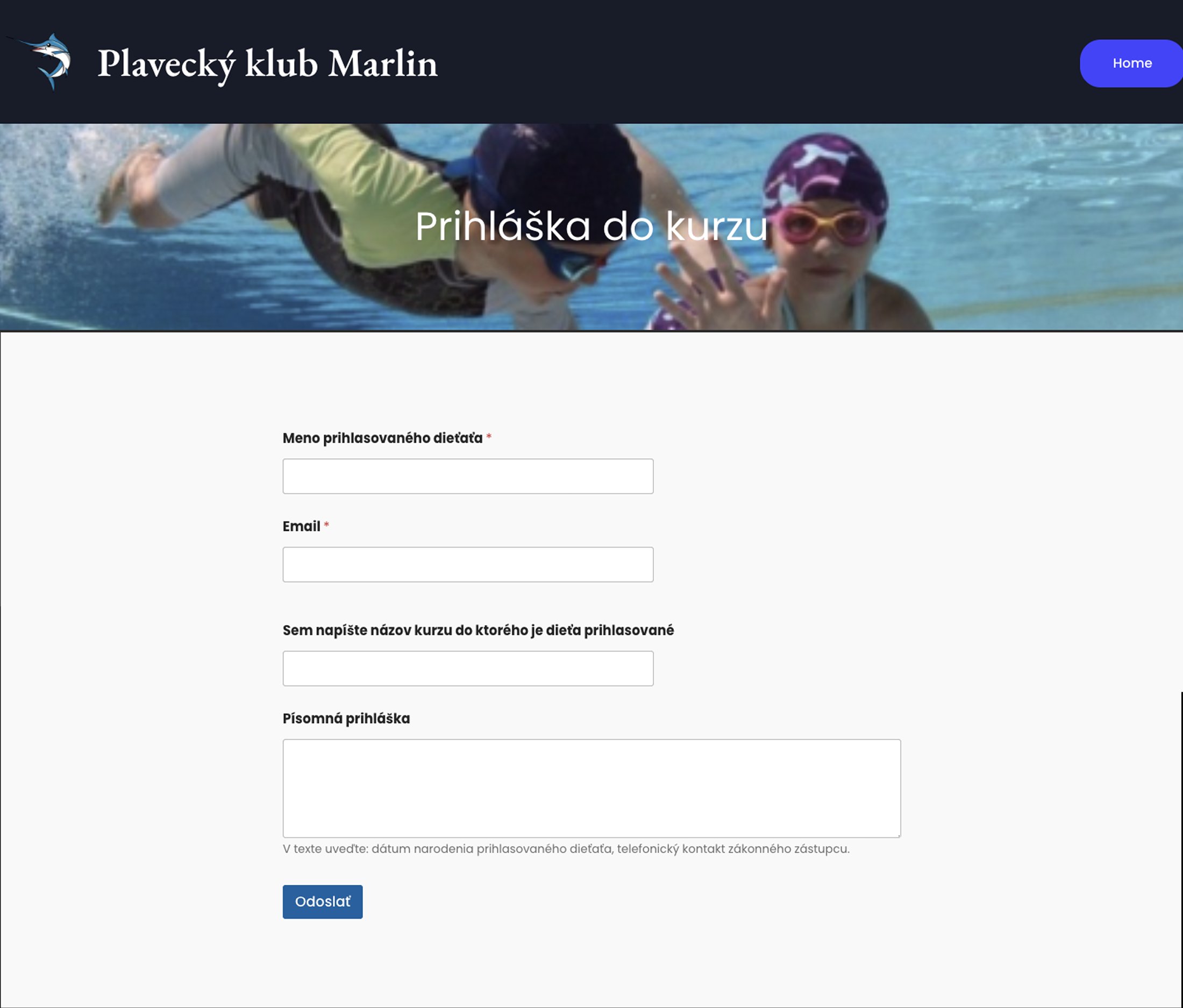
Before
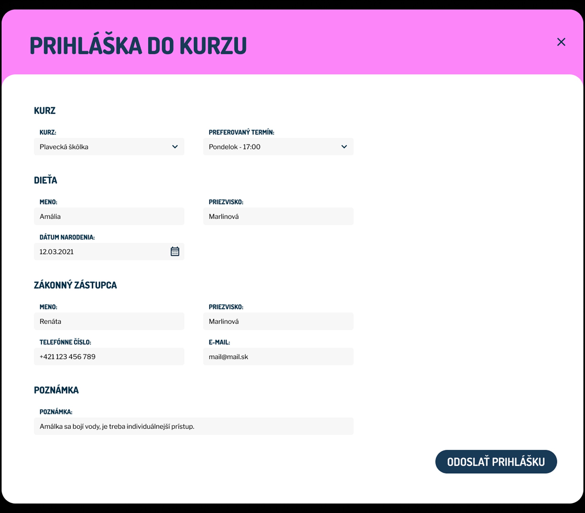
After
The results